Premium Content Writing Website Build
Project Overview
This project focused on designing and developing a bold, premium website for a content writing brand built around clarity, authority, and conversion. The goal was to move away from the typical soft, generic copywriting website aesthetic and create something that felt more confident, editorial, and modern.
The final direction blends high-contrast SaaS design with a refined creative studio feel. Inspired by the visual polish of platforms like Next.js and Retool, the site uses strong typography, sharp spacing, monochrome styling, and a distinctive writing-focused hero visual to position the brand as strategic, premium, and results-driven.
The Challenge
The brand needed a website that could communicate creativity without feeling playful, and professionalism without feeling corporate. Content writing websites often rely on predictable layouts, stock imagery, soft pastel colors, or vague messaging. This build needed to feel different.
The main objectives were to create a website that:
- Immediately positioned the brand as premium and strategic
- Worked beautifully in both dark and light mode
- Featured a strong visual identity without relying on generic imagery
- Included blogging capabilities for long-term SEO growth
- Included a portfolio system so the owner could add and manage case studies
- Was scalable, fast, and easy to maintain
The site also needed to support future content growth, meaning the blog and portfolio sections could not be treated as static pages. They needed a structure that would allow new posts, projects, categories, and media to be added over time.
The Solution
The site was planned as a modern Next.js build with a strong editorial design system and CMS-ready content architecture.
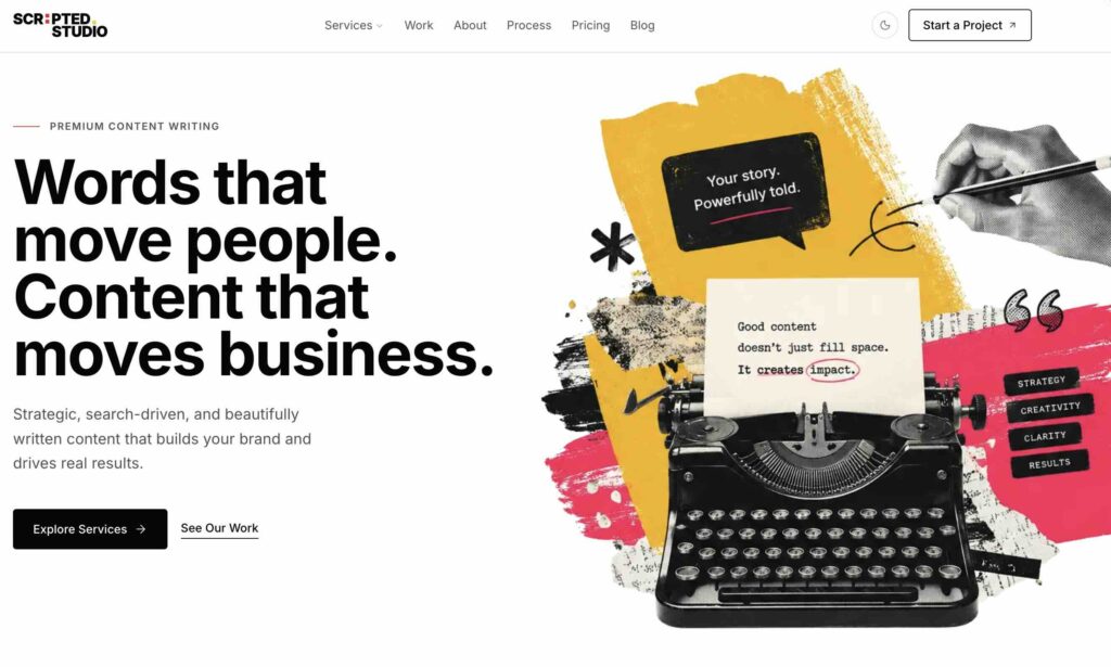
The homepage centers around a bold hero section with the headline:
Words that move people. Content that moves business.
This message gives the brand a clear positioning: the writing is not just creative, it is commercially effective.
Visually, the hero uses a premium black-and-white design language, supported by a distinctive writing illustration featuring a fountain pen, abstract paper form, and typographic words such as clarity, impact, strategy, and results. This gives the site a memorable creative element while still keeping the overall tone polished and professional.
The design system was built around:
- Bold monochrome contrast
- Large editorial typography
- Subtle borders and gradients
- Premium dark mode as the primary experience
- A refined light mode for accessibility and user preference
- Minimal motion and interaction
- Clean content hierarchy
- Reusable components for long-term scalability
Key Features
Premium Dark and Light Mode
The site was designed with both dark and light themes from the start, rather than treating light mode as an afterthought. Dark mode gives the brand a confident, premium feel, while light mode keeps the design clean, editorial, and accessible.
The theme system supports a toggle so visitors can switch between modes, with styling carried consistently across the header, hero, cards, blog pages, portfolio pages, buttons, and calls to action.
Editorial Hero Section
The hero section was created to make an immediate impression. It combines strong messaging with a custom writing-inspired visual asset that can be used across both dark and light themes.
Instead of using generic stock photography, the hero visual reinforces the brand’s core values: clarity, strategy, impact, and results.
Blog System
A blog structure was planned to support SEO and thought leadership. Each blog post can include a title, slug, excerpt, category, author, date, featured image, body content, and SEO metadata.
This allows the site owner to publish articles around content strategy, website copywriting, SEO writing, brand messaging, and conversion-focused content.
Portfolio and Case Study System
A portfolio system was included so the site owner can add new client projects and case studies over time.
Each portfolio entry is structured to include:
- Client name
- Industry
- Service type
- Project summary
- Challenge
- Solution
- Results
- Metrics
- Testimonial
- Featured image
- Gallery images
- SEO metadata
This gives the website a stronger sales function by turning past projects into proof of expertise.
CMS-Ready Architecture
The build was structured so blog posts and portfolio items can eventually be managed through a CMS such as Payload or Sanity. This gives the owner the ability to add, edit, and organize content without touching code.
The content model was planned with scalability in mind, allowing the site to grow from a simple marketing site into a full content platform.
Design Direction
The visual direction is intentionally bold and restrained. The site avoids bright colors, busy layouts, and overly playful design. Instead, it uses a premium monochrome palette, strong spacing, and confident typography.
The dark mode creates a sleek, high-end feel, while the light mode offers a refined editorial alternative. Both modes maintain the same brand personality: sharp, strategic, and polished.
The design feels suitable for founders, SaaS companies, consultants, agencies, and ambitious businesses looking for content that is not only well written but commercially useful.
Development Approach
The website was planned using a modern front-end stack:
- Next.js
- TypeScript
- Tailwind CSS
- Reusable component architecture
- Theme switching
- Dynamic blog routes
- Dynamic portfolio routes
- SEO-ready page metadata
- CMS-ready content models
The component structure was designed to keep the site maintainable, with reusable sections for services, blog previews, portfolio cards, testimonials, calls to action, and page layouts.
Results
The final concept delivers a website that feels significantly more premium than a standard content writing site. It gives the brand a strong first impression, a clear message, and a scalable foundation for publishing content and showcasing work.
The build provides:
- A distinctive visual identity
- A polished dark and light mode experience
- A flexible blog structure
- A portfolio system for case studies
- A strong homepage built around conversion
- A scalable architecture for future growth
- A professional platform for positioning the brand as a premium writing partner
Final Outcome
This website turns a content writing service into a premium digital brand. Rather than simply describing writing services, the site communicates strategy, authority, and commercial value from the first interaction.
The result is a bold, modern, and scalable website that supports both brand credibility and long-term content growth.