And why that matters even more now AI can build a website in minutes
One thing I’ve noticed from building websites over the years is that the ones that feel the most human are rarely the most technically “perfect.”
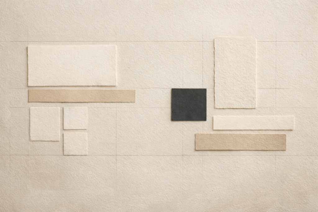
That doesn’t mean broken, messy, or badly put together. I’m not talking about sloppy work or obvious mistakes. I mean something more subtle than that. A slight asymmetry. A layout that doesn’t feel too rigid. Images that feel real rather than polished to death. Small decisions that stop a site feeling like it was generated from the same set of rules as everything else online.
I actually leave those kinds of imperfections in fairly often.
Not by accident. Intentionally.
Because in a weird way, a website can become less believable the more perfect it tries to be.
The web is getting cleaner — and less memorable
A lot of modern websites look good in the most obvious sense. Clean type. Smooth gradients. Nice spacing. Good enough motion. Everything technically “right.”
But a lot of them also feel interchangeable.
That’s become even more noticeable now AI tools can generate decent websites and landing pages in no time at all. They’re often polished, but they’re also often very samey. The layouts are familiar. The copy sounds like it’s trying hard to sound premium. The imagery is clean but vague. Everything feels a bit too resolved, a bit too safe, a bit too statistically likely.
That’s the problem for me. Not that AI-built websites are always bad. It’s that they often feel like they’ve been averaged out.
And when everything starts looking equally polished, the little human decisions start to matter more.
The Japanese idea I keep coming back to
The concept I always think about here is wabi-sabi.
It’s often simplified as “the beauty of imperfection,” which is roughly right, even if that doesn’t cover the whole thing. It’s really more about appreciating things that are slightly irregular, unfinished, weathered, or understated rather than perfectly polished. The Stanford Encyclopedia of Philosophy has a good overview of Japanese aesthetics if you want to go deeper into it.
https://plato.stanford.edu/entries/japanese-aesthetics
I think it applies really well to web design, even if people don’t usually talk about it that way.
A website doesn’t always need to look machine-made to feel professional. In fact, sometimes the opposite is true. A site can feel more trustworthy when it looks like someone actually made decisions, rather than just assembled the currently accepted version of “good design.”
That’s a big difference.
Not all imperfection is good
This is where it’s worth being clear.
There’s a big difference between intentional imperfection and poor workmanship.
Bad spacing is not a philosophy.
Broken responsiveness is not character.
Ignoring detail is not authenticity.
The foundations still need to be right. The website still needs to be clear, responsive, fast, and easy to use. It still needs structure. It still needs to work properly.
What I’m talking about is what happens once those basics are already handled.
That’s where slightly imperfect design choices can actually give a site some life. A page might feel better because it isn’t overly rigid. A section might feel more editorial and less templated. A composition might feel stronger because it’s not trying to be mathematically balanced at all times.
Those are the sorts of decisions that stop a site feeling generic.
Sometimes a slightly awkward real photo is better than a perfect fake one
The same thing applies to imagery.
In a lot of cases, I’d take a decent iPhone photo of real work over a polished stock image or an AI-generated visual every time.
That sounds obvious, but a lot of businesses still underestimate how much this matters.
A real image of something someone has actually built, installed, repaired, made, painted, fitted, or delivered often does more for trust than any amount of expensive-looking filler imagery. It proves something. It gives context. It shows the actual standard of work. It makes the business feel real.
Whereas stock images often do the opposite. They look “professional” in a vague way, but they usually say nothing. AI-generated images can be even worse for this. They can look impressive at first glance, but they don’t carry any proof. They don’t tell you anything about the actual business.
That matters more than people think.
Nielsen Norman Group has written for years about how users tend to ignore generic stock photography, while genuinely informative or specific imagery performs much better.
https://www.nngroup.com/articles/photos-as-web-content
That lines up completely with what I see in practice.
For a lot of service businesses especially, a slightly imperfect real image is often far more persuasive than something polished but generic. An iPhone shot of the actual work, the actual van, the actual team, the actual room, or the actual finished result usually feels more trustworthy because it is.
And trust is doing a lot of the work online.
The problem with over-polished websites
I think a lot of websites now suffer from being too polished in the wrong places.
They’re polished visually, but not strategically. They look refined, but they don’t say much. They feel expensive, but they don’t feel grounded. You scroll through them and get the sense that someone knew how to make things look smooth, but not necessarily how to make them feel honest.
That’s part of why I tend to prefer websites with a bit of texture.
Not visual noise for the sake of it. Just signs that a person was involved. Slight variations in rhythm. Real imagery. A bit of restraint. A bit of edge. Enough specificity that the site doesn’t disappear into the same category as every other “clean modern brand” online.
This matters even more now because AI can do “clean modern brand” very quickly.
What it’s worse at is judgment.
AI can imitate polish. It struggles more with taste
That’s really the heart of it for me.
AI is useful. I use it. It can speed things up, help with structure, help with ideas, help with getting unstuck. But the websites it tends to produce feel very close to what the average of the internet already looks like.
That’s fine if average is the goal.
But if the aim is to make a website feel specific, memorable, and properly tied to the business behind it, then human taste still matters a lot. Not because humans are magical, but because good design decisions are usually contextual. They depend on knowing what to keep, what to remove, what to leave slightly unresolved, and what makes this business different from every other one trying to look polished online.
That’s hard to automate.
Originality is becoming more valuable, not less
This ties into SEO as well.
Google has made it pretty clear that what it wants is content that is genuinely useful and created for people, not just search engines.
https://developers.google.com/search/docs/fundamentals/creating-helpful-content
That principle applies to websites more broadly too. Original wording, real imagery, distinctive structure, and a clear sense of who the business actually is all help a site feel stronger — both for users and for search.
The same goes for how AI systems interpret websites. If everything about a site is generic, the signals are generic too. If the wording is original, the imagery is real, and the design has some actual personality, then the site gives off much clearer signals about what it is and who it’s for.
So originality isn’t anti-SEO. If anything, it’s becoming more important.
Why I leave slight imperfections in
So when I leave a slight imperfection in a website, it’s usually because removing it would make the site feel worse, not better.
Maybe it makes the layout feel less templated.
Maybe it adds a bit of tension.
Maybe it makes the page feel more natural.
Maybe it stops the whole thing looking too sterile.
The goal isn’t to make something rough. It’s to stop it feeling over-processed.
That’s especially important now, because so much of the web is moving toward fast, clean, machine-assisted sameness. When that happens, the small signs of authorship start to stand out more.
And I think people still respond to that, even if they don’t consciously know why.
Final thought
I don’t think the answer is to reject good systems, or modern tools, or even AI. I care about performance, structure, SEO, responsiveness, and getting things right technically. That stuff matters.
But I also think there’s value in leaving room for a website to feel made rather than generated.
Sometimes that means using a real photo instead of a slick stock image. Sometimes it means not sanding down every visual edge. Sometimes it means trusting that a slightly imperfect composition can feel more human than a perfectly symmetrical one.
A lot of the best websites don’t feel flawless.
They feel inhabited.